People Who Won the Pritzker Architecture Prize
An interactive data visualization project to explore the life of the Pritzker Architecture Prize's laureates
- Course: Advanced Infographics and Data Visualization
- Duration: 2 months [ Apr - Jun 2020 ]
- Role: Independent project, full stack designer & developer
- Prototyping Tools: Photoshop, Illustrator, Excel
- Programming language & lib: HTML, CSS, JS, D3.js
What makes a master architect a master?
When a person decided to become an architect, this is a question he or she would definitely ask. So did I. After more than ten years, I finally got the chance to explore this question with the skills and knowledge of a journalist, an architect, and a programmer.
PROJECT GAOL
Besides exploring the “secret lives” of these master architects, another goal of this project is to explore how to make a data visualization project more attractive. I set up three design principles front up [1]:
- show a lot of “faces”.
- “fold” all the contents in one screen to make readers scroll as little as possible.
- create a project with sounds (haven’t implemented).
[1] I hadn’t done any researches about whether the three approaches would present information more effectively. They were just my assumptions. It might be very interesting to do a study about it in the future.
Project demo
process

inspiration
Nobels no degrees
The infographic created by Giorgia Lupi, Nobels no degrees, is my initial motivation to do this project. It is one of the most elegant infographics I’d ever seen, which is literally art. However, essencially, the primary focus of Nobels no degrees is the Nobel Prize not the laureates. Readers have no idea who are these laureates, what kind of life they had lived. I want to do a project with a similar topic but focus on the stories of the people behind.
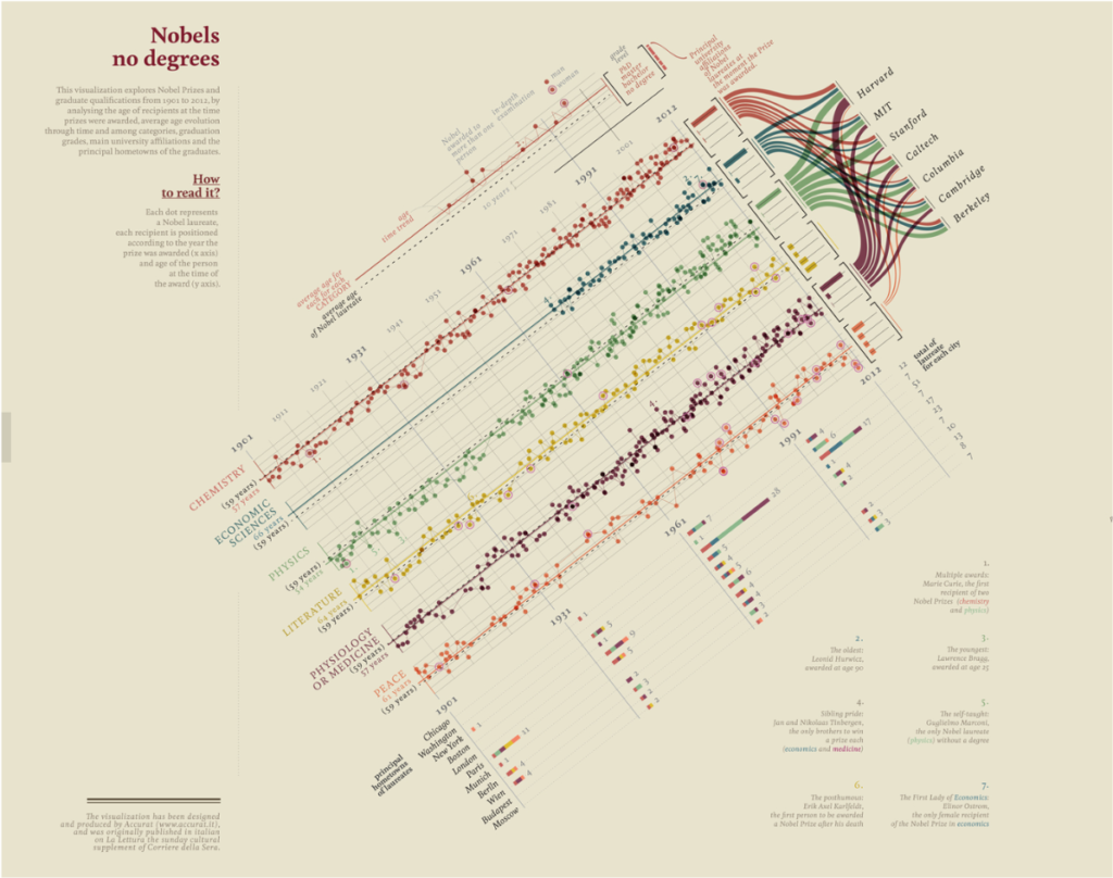
Infographic Design of Giorgia Lupi (Original Documentation)
The World through the Eyes of the US
The World through the Eyes of the US is an interactive data visualization project on The Pudding. The way it presents information with different levels of detail gave me a deep impression. I case-studied this project and documented it in my journal. When I began thinking about how to present data in People Who Won the Pritzker Architecture Prize, I unconsciously adopted a similar way of showing information and organizing readers’ behaviors.
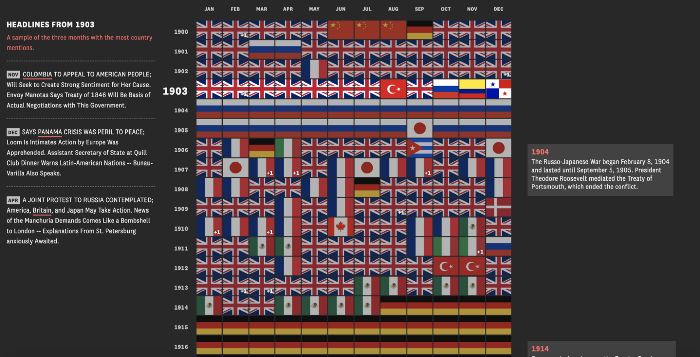
A screenshot of The World through the Eyes of the US
Early stage prototype
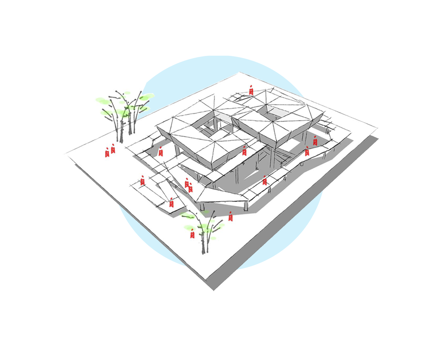
Before decided any topics, I made a prototype by Adobe illustrator to show the pattern in the “ages” when these laureates received the award (which is definitely one of the topics I want to visualize). It is the start point of the whole project.
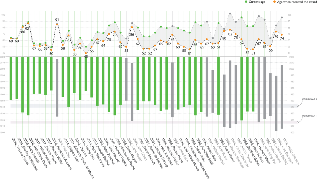
Pinpoint Topics
The project are consist of sixteen topics/ questions. For myself was the “domain expert”, so I assigned these topics based on my personal experience and knowledge. The project at this point doesn’t include topics about the design and the building works of the laureates.
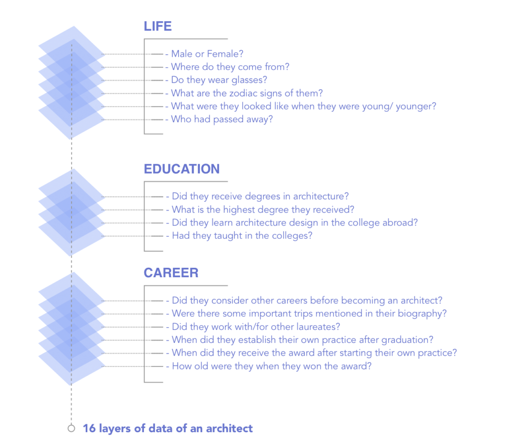
project envision
Information Hierarchy & Layout
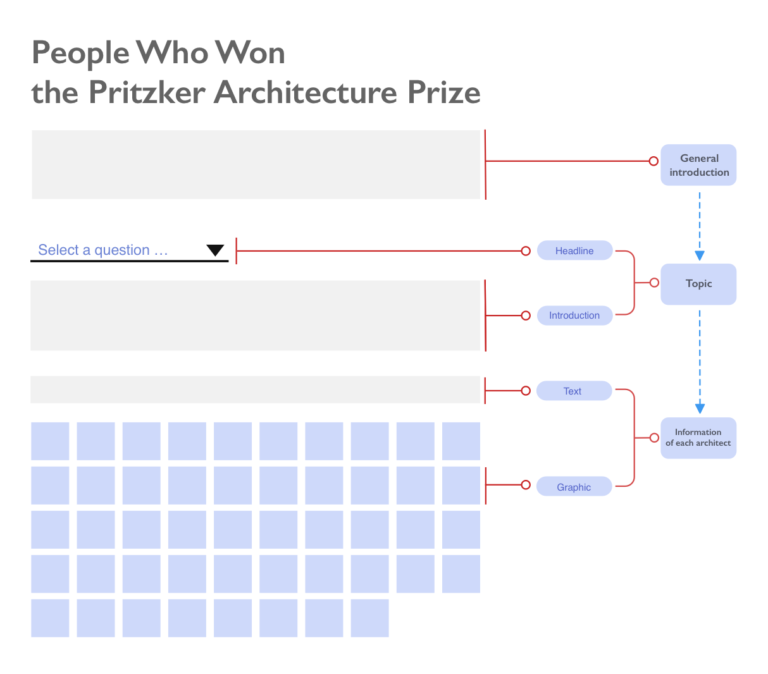
Interaction Design
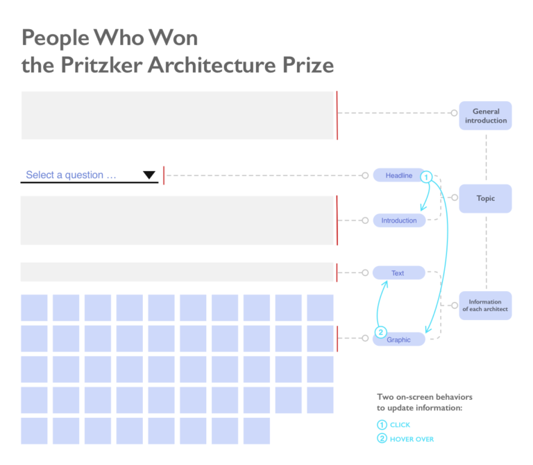
Implementation
I did the prototype using d3.js from the very beginning. As a novice d3 developer, the project’s form and content were limited by my proficiency in programming to a great extent. Therefore, after I became more familiar with Javascript, I added more content (there were only five topics in the original project) and visually polished it.
reflection
A topic about "sound"
One more topic in the “CAREER ” in the original design was the first sentence of each architect’s speech in the award ceremony. This topic is actually very important for the project. On the one hand, I found a trend of speaking the laureates’ first language instead of English in recent years. On the other hand, I believe that listening to these architects’ voice would really bring the project to life.
While most laureates started the speech by greeting the host and audiences, some said something very different. As the laureate of 2016, Alejandro Aravena, his first sentence was “this is going to be very tough.” Because the laureate of 2004, Zaha Hadid, passed away just a week before the award ceremony, who greatly influenced him. The project doesn’t need to include information like this. To encourage readers to explore more behind the scene, showing one such sentence is enough.
Limitation & Concerns
- Technical Feasibility: after I learned React.js, I realized that it would be a much better practice to code this project with React. The current structure of the scripts is hard to make future development effective.
- Responsive Design: this project doesn’t have a mobile version at this point. It works fine for tablets, but not the screen with a smaller size. The mobile version might need a new design of the layout, interaction, and new technology.
Next Step
- Add the voice of the laureates in the project.
- Design and develop the mobile version.

